Ruck
Designing Ruck
A lot of the design decisions behind Ruck come from a place of admiration. I’ve spent more than a decade using different tools to manage projects and tasks, and brought a lot of what I’ve enjoyed into Ruck.
These are the tools that came to mind when I looked at what had influenced the design. Some connections were deliberate. Others only clicked afterwards.
Navigation
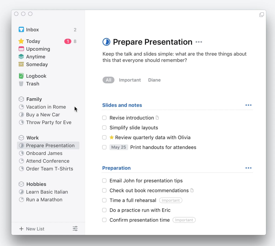
I don’t think anyone has made navigating a task app feel easier than Cultured Code’s Things. It might be the app I’ve used longer than any other, and its overall structure has never been beaten for me.
A simple left sidebar gives you access to your inbox, upcoming tasks, projects and other views. You know where things are, and getting to them takes very little effort.
It’s no coincidence that I tried to bring that simplicity into Ruck’s sidebar. The aim was straightforward: tasks should never be more than two clicks away.
Scannable task lists
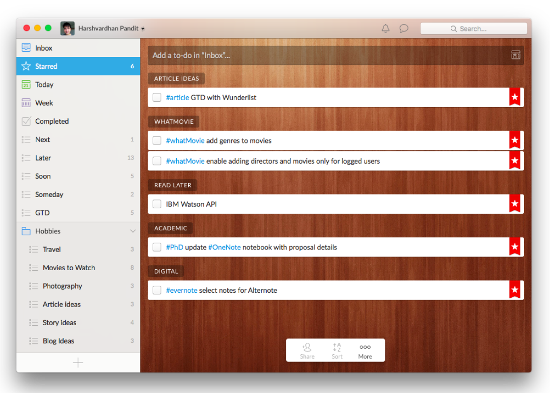
Going back a good few years now, before Microsoft acquired it, Wunderlist was a trailblazer in the to-do app space. In no small part because it just looked so good.
There were lovely little details and customisation options, but what stood out to me was how it displayed tasks. Spacious, well-presented cards that gave each task a little room to breathe.
That extra space made a difference to the mental load on a tired Monday morning. It’s something I wanted to carry into Ruck, where you can scan a list and make sense of it without everything being squeezed into a dense table.
Status handling
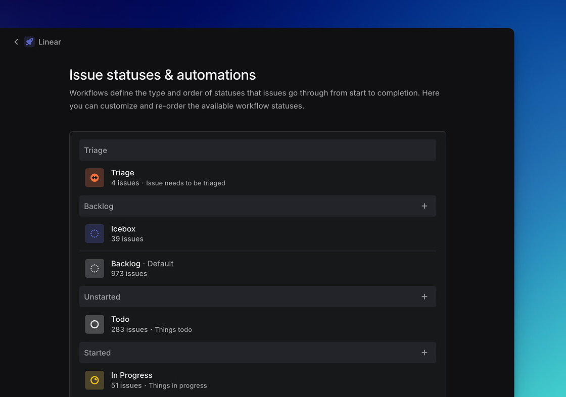
I can’t think of anyone who has handled the visual language around statuses better than Linear.
It’s a beautiful pattern that makes a task’s status easy to recognise at a glance. I don’t remember noticing that treatment before Linear, and I’ve since seen similar approaches appear in other tools.
That clarity was what I wanted to bring into Ruck. You should be able to look down a list and get a feel for where the work stands.
Some honourable mentions
Things, Wunderlist and Linear are the influences I can point to most directly. Others contributed to the overall feel.
I used Basecamp 2 back in the day and never forgot how easy its single-page project view was to make sense of. Ruck’s insights draw on an earlier design of mine at Gretel, and my preference for graphs that don’t give me a headache.
I started writing this to give a nod to the tools I’ve used and admired over the years. Looking back, it’s interesting how much of Ruck came from small preferences I’d picked up along the way, sometimes without realising.
Knowing where to find something. Having enough space to read it. Understanding its status without opening it. Those details stayed with me, and they’re the ones I’ve tried to get right in Ruck.